VISUAL IDENTITY
Brand Patterns

Explore the Different Patterns

The MassMutual dots are featured in several different patterns. Patterns are used in a variety of ways to add visual interest and further identify communications as being MassMutual branded, and for the most part derive from our "M" icon.

Pattern image

01 | Extension Pattern

Gallery image

02 | Swoop Pattern

Gallery image

03 | B2B Grid Pattern

Gallery image

04 | Dissolve Pattern

Gallery image

05 | Flow Pattern

Gallery image

06 | Slice Patterns

Graphic Dots Breakdown

The design of our communication brings focus on the moments, both big and small, where we rely on one another. One device we’ve developed to provide visual interest, a strong graphic tie to the identity, as well as this idea of focus, is the large scale graphic dot.

The chart at below shows the development of the graphic dot and how it was derived from the logomark. It captures the animation of the mark building and helps impart a sense of motion, direction, and progress to our layouts.

Graphic Dots

Super Dots

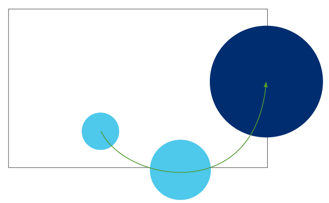
The dots can be used in large sizes to help organize the layout and lead the viewer’s eye.

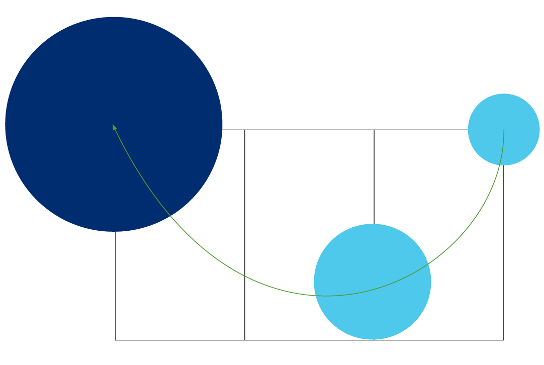
The green path, indicated on the examples, shows how the path of the dots moves from the interior of the composition outward. Note: This green path is for demonstration purposes and is not part of the actual artwork.

The device is always cropped by some element of the layout, be it an edge or a fold, in at least two places. The center of the largest dot is always located on the fold, edge, or corner of the layout.

Here are some ways to employ the Dots Supergraphic.

Gallery image

01 | One Panel

Gallery image

02 | Two Panels

Gallery image

03 | Three Panels

Gallery image

04 | Over a Photo

Super Dots Example

B2C Dot Pathway

When we look at the larger picture of the moments that make up our various life stages, we see pathways. These paths intertwine and overlap and become something we share with the people we love. MassMutual helps us focus on those moments. Moments that help build a life that revolves around our connection to the people we care about.

Another device we use to help illustrate this concept in consumer-facing communications is the Dot Pathway. It helps guide the viewer’s eye through a piece, as well as provide a subtle sense of motion as well as visual interest.

This pattern has been supplied as artwork and should never be recreated in order to maintain consistency.

Pathway pattern examples

Dot Supersized Graphic

The Dot Supersized Graphic is a device derived from the identity that we use in our business-to-business communications to provide focus and visual interest. Its simple yet strong qualities help differentiate business-to-business pieces from the business-to-consumer pieces.

These examples show the origins of the circular container shape as well as its primary locations. Like some of the other graphic devices we use that are dealing with focus, the container is always used large and will always touch or be bisected by the edge or fold of the page or screen.

Supersized graphic pattern examples

Here are examples of how compositions can be built using the Dot Supersized Graphic to section space and provide areas of both interest and focus. It also provides areas that naturally lend themselves to content such as type, data visualizations, or illustrations.

More Supersized graphic pattern examples